HOTSPOT -
You need to create a visual as shown in the following exhibit.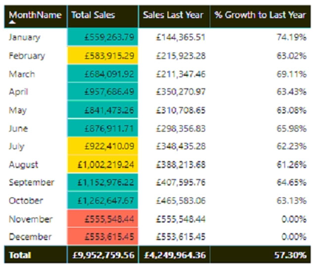
The indicator color for Total Sales will be based on % Growth to Last Year.
The solution must use the existing calculations only.
How should you configure the visual? To answer, select the appropriate options in the answer area.
NOTE: Each correct selection is worth one point.
Hot Area:
Answer:
Box 1: Background color -
To apply conditional formatting, select a Table or Matrix visualization in Power BI Desktop. In the Visualizations pane, right-click or select the down-arrow next to the field in the Values well that you want to format. Select Conditional formatting, and then select the type of formatting to apply.
Box 2: Rules -
To format cell background or font color by rules, in the Format by field of the Background color or Font color dialog box, select Rules.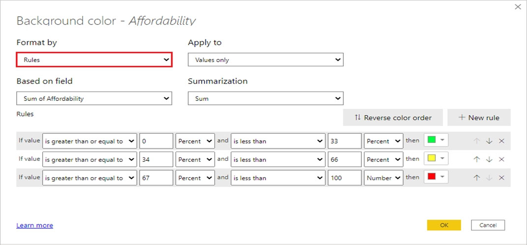
Reference:
https://docs.microsoft.com/en-us/power-bi/create-reports/desktop-conditional-table-formatting
DRAG DROP -
You are using existing reports to build a dashboard that will be viewed frequently in portrait mode on mobile phones.
You need to build the dashboard.
Which four actions should you perform in sequence? To answer, move the appropriate actions from the list of actions to the answer area and arrange them in the correct order.
Select and Place:
Answer:
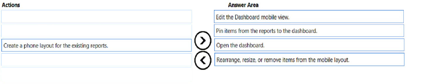
Step 1: Edit the dashboard mobile view
Open a report in Editing view.
Step 2: Pin items from the reports to the dashboard
Step 3: Open the dashboard.
Open the dashboard to see the pinned live tile,
From the nav pane, select the dashboard with the new live tile. There, you can do things like rename, resize, link, and move the pinned report page.
Step 4: Rearrange, resize, or remove items from the mobile layout
Reference:
https://docs.microsoft.com/en-us/power-bi/create-reports/service-dashboard-pin-live-tile-from-report
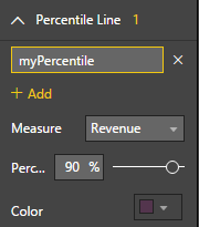
You plan to create the chart shown in the following exhibit.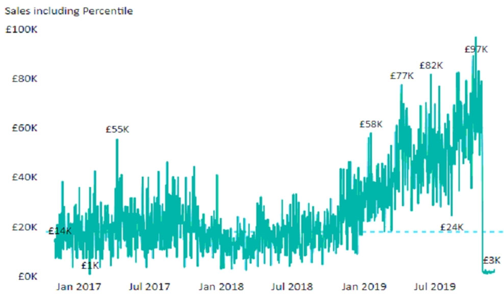
How should you create the dashed horizontal line denoting the 40th percentile of daily sales for the period shown?
Answer:
C
The analytics feature enables you to show percentiles across groups specified along a specific axis.
1. Click on the analytics tab
2. Select Percentile
3. You can choose a specific percentile along with other formatting options.
4. Drag a date or non-numeric dimension into the Axis of a column chart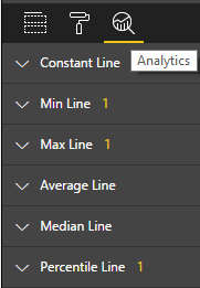
Reference:
https://www.dash-intel.com/powerbi/statistical_functions_percentile.php
You are building a Power BI report.
Users will view the report by using their mobile device.
You need to configure the report to display data based on each user's location.
Which two actions should you perform? Each correct answer presents part of the solution.
NOTE: Each correct selection is worth one point.
Answer:
BD
B: Identify geographic data in your report
1. In Power BI Desktop, switch to Data View Data View icon.
2. Select a column with geographic data ג€" for example, a City column.
3. On the Modeling tab, select Data Category, then the correct category ג€" in this example, City.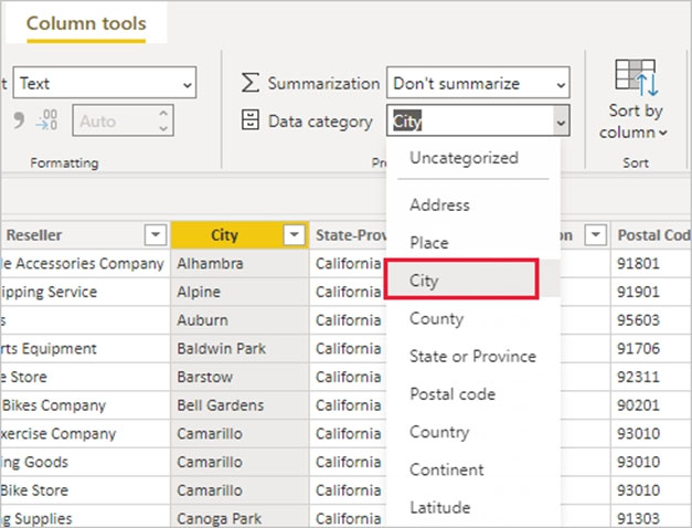
4. Continue setting geographic data categories for any other fields in the model.
D: Create visuals with your geographic data
Switch to Report view Report View icon, and create visuals that use the geographic fields in your data.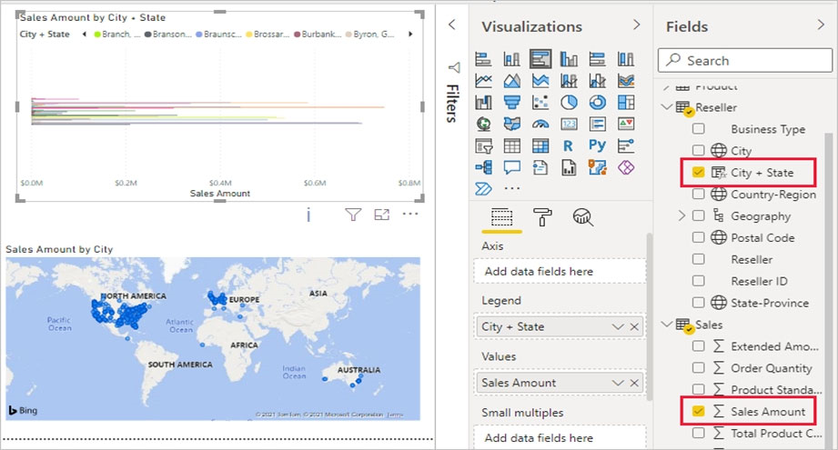
In this example, the model also contains a calculated column that brings city and state together in one column.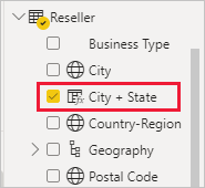
Publish the report to the Power BI service.
Reference:
https://docs.microsoft.com/en-us/power-bi/transform-model/desktop-mobile-geofiltering
You have a report that contains a donut chart and a clustered column chart. Interactions between the visuals use the default settings.
You need to modify the report so that when you select a column in the column chart, the donut chart redraws by using the data from the selected column.
What should you do?
Answer:
B
Filters remove all but the data you want to focus on.
Note: Enable the visual interaction controls.
1. Select a visualization to make it active.
2. Display the Visual Interactions options.
3. In Power BI Desktop, select Format > Edit interactions.
4. To display the visualization interaction controls, select Edit interactions. Power BI adds filter and highlight icons to all of the other visualizations on the report page.
We can see that the tree map is cross-filtering the line chart and the map, and is cross-highlighting the column chart. You can now change how the selected visualization interacts with the other visualizations on the report page.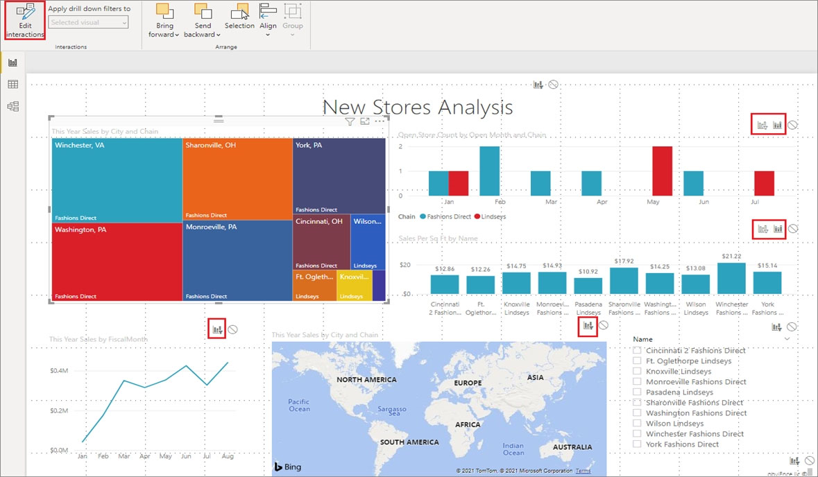
Reference:
https://docs.microsoft.com/en-us/power-bi/create-reports/service-reports-visual-interactions
HOTSPOT -
You have a report page that contains the visuals shown in the following exhibit.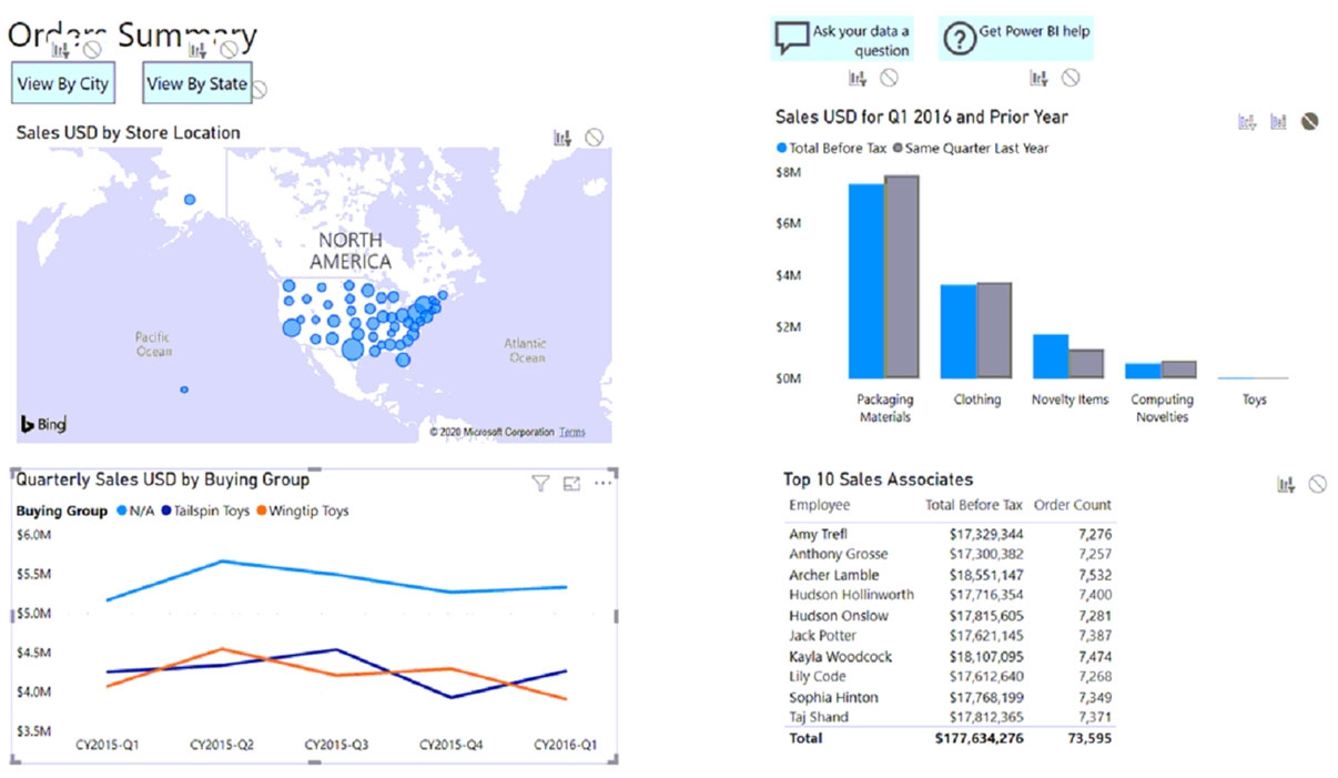
Use the drop-down menus to select the answer choice that completes each statement based on the information presented in the graphic.
NOTE: Each correct selection is worth one point.
Hot Area: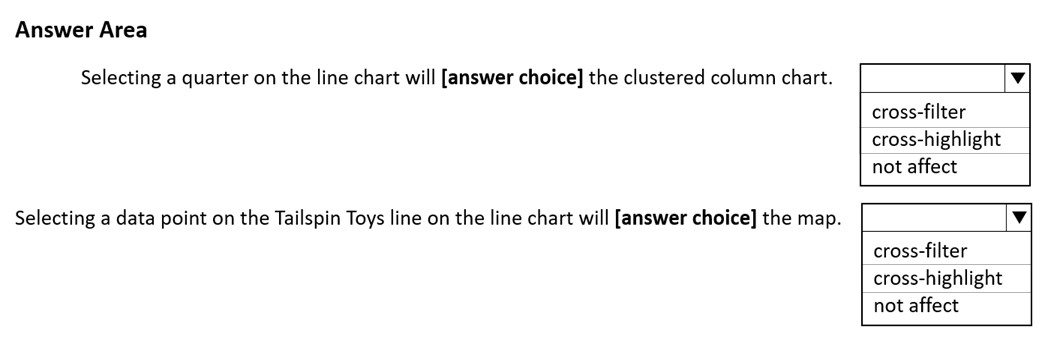
Answer:
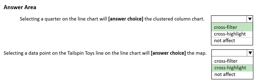
Box 1: cross-filter -
The Cluster column chart has the filter icon active.
Box 2: cross-highlight -
The map has the cross-highlight icon active.
Reference:
https://docs.microsoft.com/en-us/power-bi/create-reports/service-reports-visual-interactions
You are creating a Power BI report by using Power BI Desktop.
You need to include a visual that shows trends and other useful information automatically. The visual must update based on selections in other visuals.
Which type of visual should you use?
Answer:
B
The smart narrative visualization helps you quickly summarize visuals and reports. It provides relevant innovative insights that you can customize.
Use smart narrative summaries in your reports to address key takeaways, to point out trends, and to edit the language and format for a specific audience. In
PowerPoint, instead of pasting a screenshot of your report's key takeaways, you can add narratives that are updated with every refresh. Your audience can use the summaries to understand the data, get to key points faster, and explain the data to others.
Reference:
https://docs.microsoft.com/en-us/power-bi/visuals/power-bi-visualization-smart-narrative
In Power BI Desktop, you have a dataset that contains a table.
You create a table visual on a Power BI report page as shown in the following exhibit.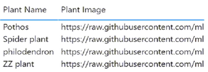
You need to configure the visual to display the referenced image instead of the URL in the Plant Image column.
What should you do?
Answer:
D
Add images to your report -
1. Create a column with the URLs of the images. See Considerations later in this article for requirements.
2. Select that column. On the Column tools ribbon, for Data category, select Image URL.
3. Add the column to a table, matrix, slicer, or multi-row card.
Step 3: From powerbi.com, add a tile for Excel1 dataset to DashboardA.
In the Power BI service (app.powerbi.com), a dashboard contains tiles pinned from one or more datasets, so you can ask questions about any of the data contained in any of those datasets.
Reference:
https://docs.microsoft.com/en-us/power-bi/create-reports/power-bi-images-tables https://docs.microsoft.com/en-us/power-bi/create-reports/power-bi-tutorial-q-and-a
DRAG DROP -
You have a Microsoft Excel spreadsheet named Excel1 that contains survey results.
You have a Power BI dashboard named DashboardA that has Q&A enabled.
You need to ensure that users who can access DashboardA can ask questions based on the contents of Excel1 and pin visuals based on their queries to
DashboardA. The solution must minimize development time.
Which three actions should you perform in sequence? To answer, move the appropriate actions from the list of actions to the answer area and arrange them in the correct order.
Select and Place:
Answer:
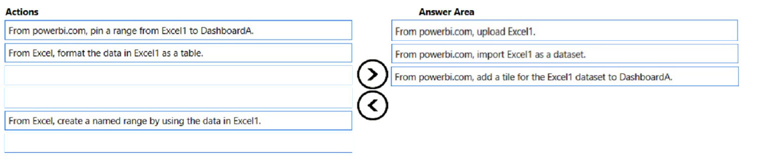
Step 1: From powerbi.com, upload Excel1.
Upload your Excel file to the Power BI service.
The Power BI service connects to many data sources, including Excel files that live on your computer.
1. Sign in to the Power BI service.
2. In My workspace, select New > Upload a file.
3. Select Local File, browse to where you saved the Financial Sample Excel file, and select Open.
4. On the Local File page, select Import.
Now you have a Financial Sample dataset. Power BI also automatically created a blank dashboard. If you don't see the dashboard, refresh your browser.
Step 2: From powerbi.com, import Excel1 as a dataset.
Step 3: From powerbi.com, add a tile for the Excel1 dataset to DashboarA.
Reference:
https://docs.microsoft.com/en-us/power-bi/create-reports/service-from-excel-to-stunning-report
Note: This question is part of a series of questions that present the same scenario. Each question in the series contains a unique solution that might meet the stated goals. Some question sets might have more than one correct solution, while others might not have a correct solution.
After you answer a question in this section, you will NOT be able to return to it. As a result, these questions will not appear in the review screen.
You have a clustered bar chart that contains a measure named Salary as the value and a field named Employee as the axis. Salary is present in the data as a numerical amount representing US dollars.
You need to create a reference line to show which employees are above the median salary.
Solution: You create a constant line and set the value to .5.
Does this meet the goal?
Answer:
B
Instead: You create a percentile line by using the Salary measure and set the percentile to 50%.
The median is the middle value or the 50th percentile of a data set.
Reference:
https://dash-intel.com/powerbi/statistical_functions_median.php