Note: This question is part of a series of questions that present the same scenario. Each question in the series contains a unique solution that might meet the stated goals. Some question sets might have more than one correct solution, while others might not have a correct solution.
After you answer a question in this section, you will NOT be able to return to it. As a result, these questions will not appear in the review screen.
You have a clustered bar chart that contains a measure named Salary as the value and a field named Employee as the axis. Salary is present in the data as a numerical amount representing US dollars.
You need to create a reference line to show which employees are above the median salary.
Solution: You create an average line by using the Salary measure.
Does this meet the goal?
Answer:
B
Average is not Median.
Instead: You create a percentile line by using the Salary measure and set the percentile to 50%.
The median is the middle value or the 50th percentile of a data set.
Reference:
https://dash-intel.com/powerbi/statistical_functions_median.php
Note: This question is part of a series of questions that present the same scenario. Each question in the series contains a unique solution that might meet the stated goals. Some question sets might have more than one correct solution, while others might not have a correct solution.
After you answer a question in this section, you will NOT be able to return to it. As a result, these questions will not appear in the review screen.
You have a clustered bar chart that contains a measure named Salary as the value and a field named Employee as the axis. Salary is present in the data as a numerical amount representing US dollars.
You need to create a reference line to show which employees are above the median salary.
Solution: You create a percentile line by using the Salary measure and set the percentile to 50%.
Does this meet the goal?
Answer:
A
The median is the middle value or the 50th percentile of a data set.
Reference:
https://dash-intel.com/powerbi/statistical_functions_median.php
HOTSPOT -
You are profiling data by using Power Query Editor.
You have a table that contains a column named column1. Column statistics and Value distribution for column1 are shown in the following exhibit.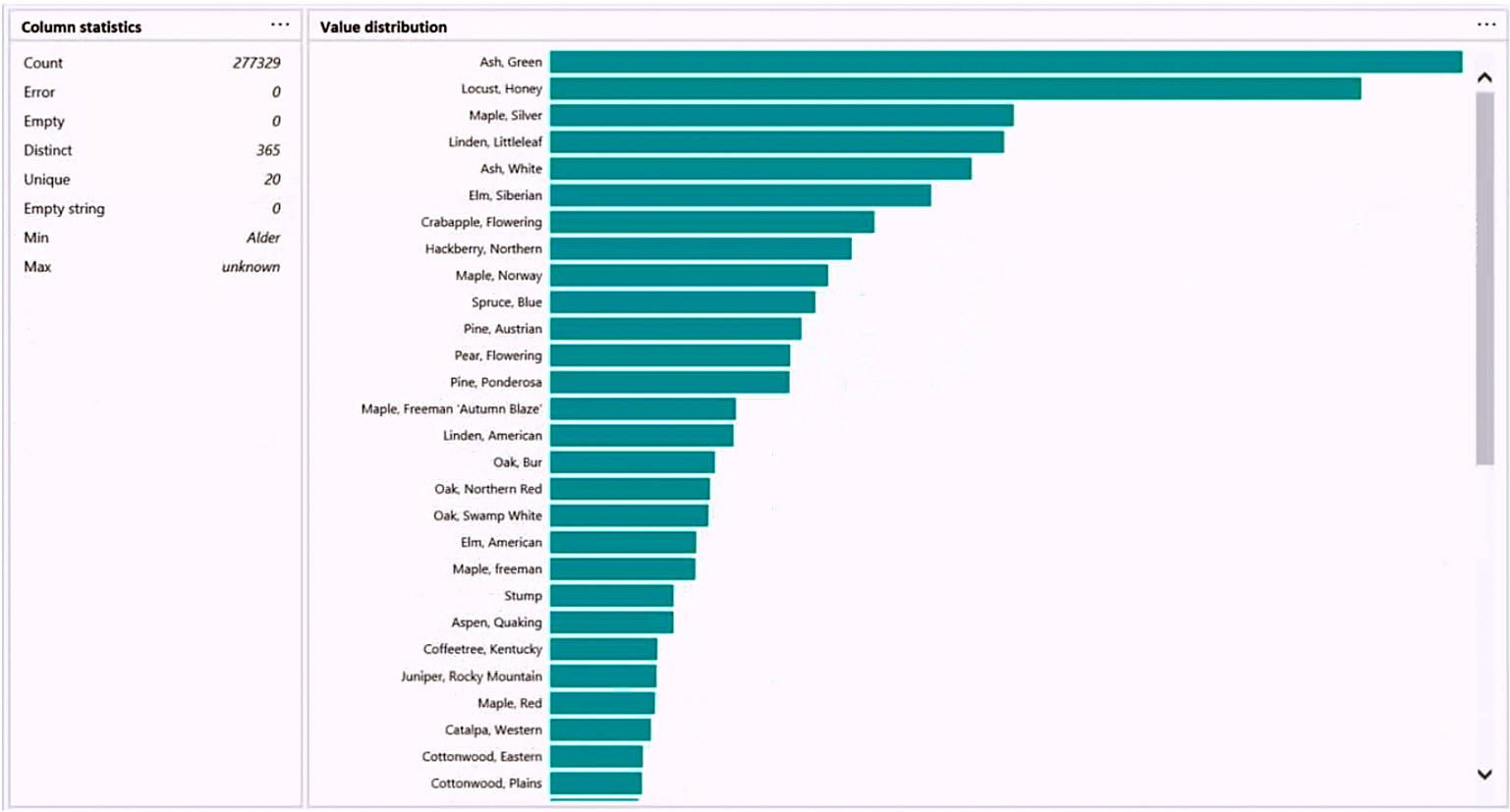
Use the drop-down menus to select the answer choice that completes each statement based on the information presented in the graphic.
NOTE: Each correct selection is worth one point.
Hot Area: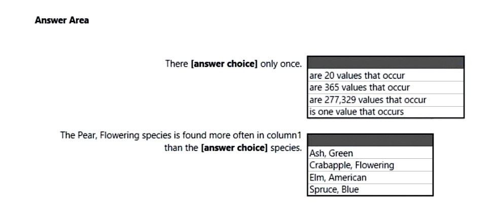
Answer:
Box 1: are 20 values that occur -
There are 20 unique values.
Box 2: Elm, American -
Elm, American is below Peer, flowering species in the graphic.
You have a Power BI report hosted on powerbi.com that displays expenses by department for department managers.
The report contains a line chart that shows expenses by month.
You need to enable users to choose between viewing the report as a line chart or a column chart. The solution must minimize development and maintenance effort.
What should you do?
Answer:
C
Let users personalize visuals in a report
Enable personalization in a report
You can enable the feature either in Power BI Desktop or the Power BI service. You can also enable it in embedded reports.
To enable the feature in the Power BI (powerbi.com) service, go to Settings for your report.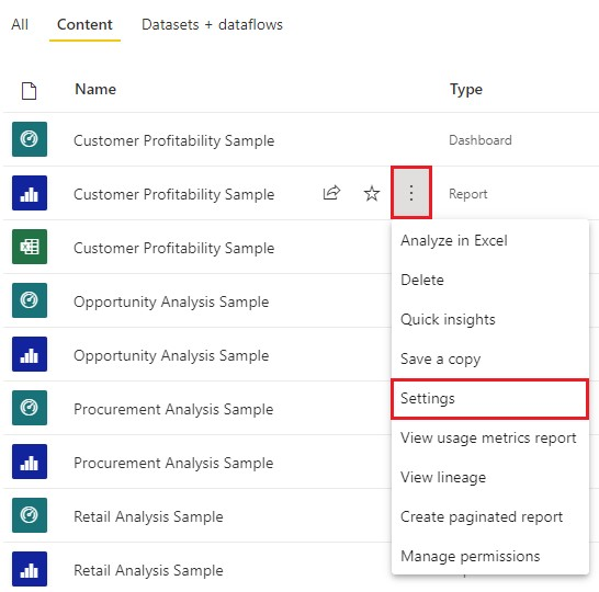
Turn on Personalize visuals > Save.
Reference:
https://docs.microsoft.com/en-us/power-bi/create-reports/power-bi-personalize-visuals?tabs=powerbi-service#enable-personalization-in-a-report
HOTSPOT -
You have a dataset that contains revenue data from the past year.
You need to use anomaly detection in Power BI to show anomalies in the dataset.
What should you configure? To answer, select the appropriate options in the answer area.
NOTE: Each correct selection is worth one point.
Hot Area: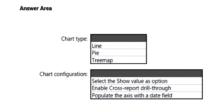
Answer:
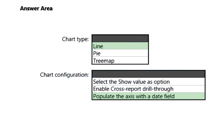
Box 1: Line -
Anomaly detection is only supported for line chart visuals containing time series data in the Axis field.
Box 2: Populate the axis with a date field
Incorrect:
* Anomaly Explanations doesn't work with 'Show Value As' options.
* Drilling down to go to the next level in the hierarchy isn't supported.
Reference:
https://docs.microsoft.com/en-us/power-bi/visuals/power-bi-visualization-anomaly-detection
You have a line chart that shows the number of employees in a department over time.
You need to see the total salary costs of the employees when you hover over a data point.
What should you do?
Answer:
C
Customize tooltips with aggregation or quick measures
You can customize a tooltip by selecting an aggregation function.
Select the arrow beside the field in the Tooltips bucket. Then, select from the available options.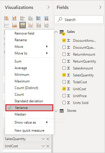
Note: Tooltips are an elegant way of providing more contextual information and detail to data points on a visual. You can customize tooltips in Power BI Desktop and in the Power BI service.
When a visualization is created, the default tooltip displays the data point's value and category.
Reference:
https://docs.microsoft.com/en-us/power-bi/create-reports/desktop-custom-tooltips
You have the visual shown in the Original exhibit. (Click the Original tab.)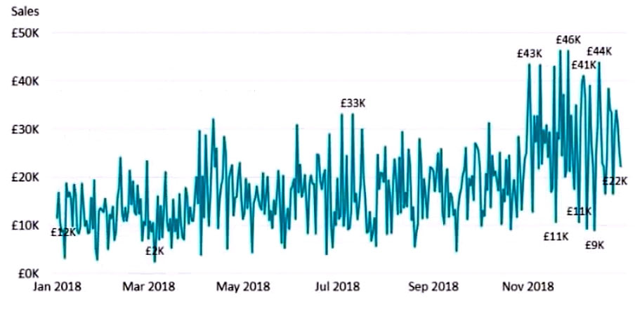
You need to configure the visual as shown in the Modified exhibit. (Click the Modified tab.)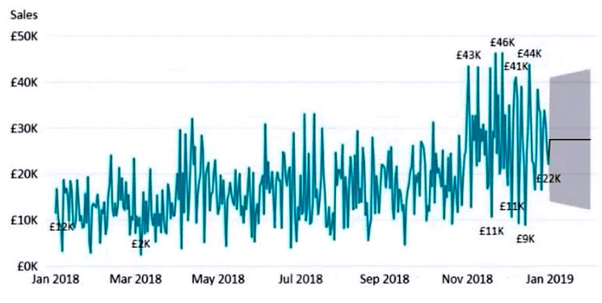
What should you add to the visual?
Answer:
D
For example, here's how the current forecast looks like: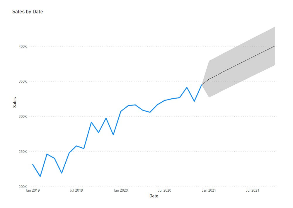
Reference:
https://spreadsheeto.com/power-bi-forecasting/#intro
You need to create a visual that enables the adhoc exploration of data as shown in the following exhibit.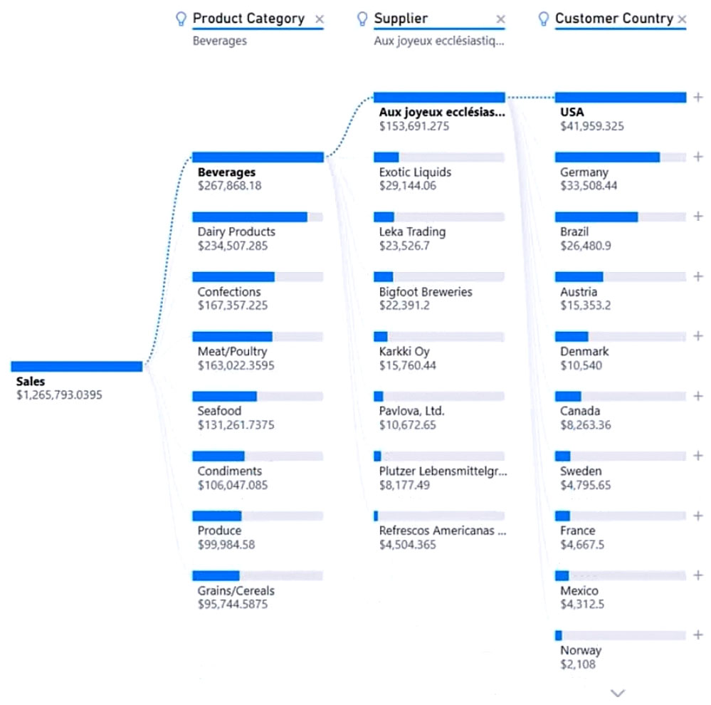
Which type of visual should you use?
Answer:
B
The decomposition tree visual in Power BI lets you visualize data across multiple dimensions. It automatically aggregates data and enables drilling down into your dimensions in any order. It is also an artificial intelligence (AI) visualization, so you can ask it to find the next dimension to drill down into based on certain criteria.
This makes it a valuable tool for ad hoc exploration and conducting root cause analysis.
Example: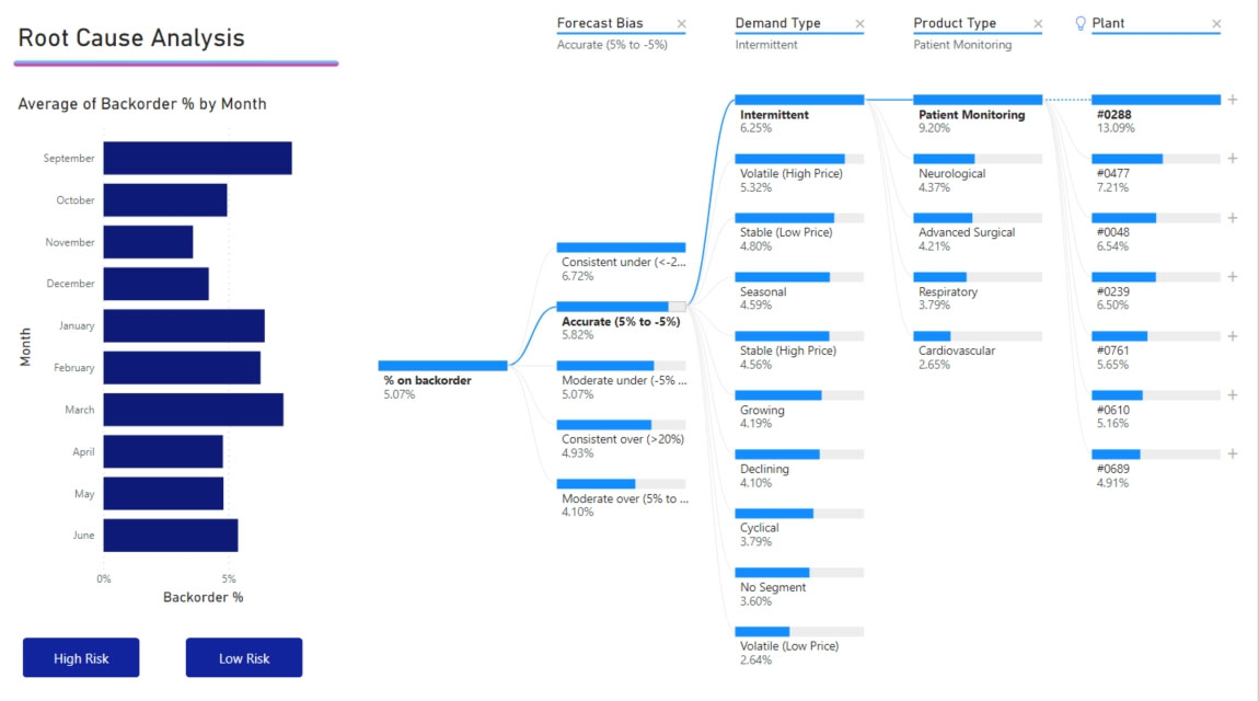
Reference:
https://docs.microsoft.com/en-us/power-bi/visuals/power-bi-visualization-decomposition-tree
Your company has employees in 10 states.
The company recently decided to associate each state to one of the following three regions: East, West, and North.
You have a data model that contains employee information by state. The model does NOT include region information.
You have a report that shows the employees by state.
You need to view the employees by region as quickly as possible.
What should you do?
Answer:
C
In Power BI Desktop, you can group data points to help you more clearly view, analyze, and explore data and trends in your visuals.
Example: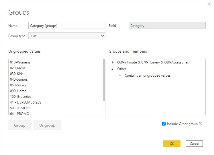
Incorrect:
Not D: You can also define the bin size to put values into equally sized groups that better enable you to visualize data in ways that are meaningful. This action is often called binning.
Reference:
https://docs.microsoft.com/en-us/power-bi/create-reports/desktop-grouping-and-binning
You have a collection of reports for the HR department of your company.
You need to create a visualization for the HR department that shows historical employee counts and predicts trends during the next six months.
Which type of visualization should you use?
Answer:
C
The best data for forecasting is time series data or uniformly increasing whole numbers. The line chart has to have only one line.
Reference:
https://powerbi.microsoft.com/fr-ca/blog/introducing-new-forecasting-capabilities-in-power-view-for-office-365/