You are using the key influencers visual to identify which factors affect the quantity of items sold in an order.
You add the following fields to the Explain By field:
✑ Customer Country
✑ Product Category
✑ Supplier Country
✑ Sales Employee
✑ Supplier Name
✑ Product Name
✑ Customer City
The key influencers visual returns the results shown in the following exhibit.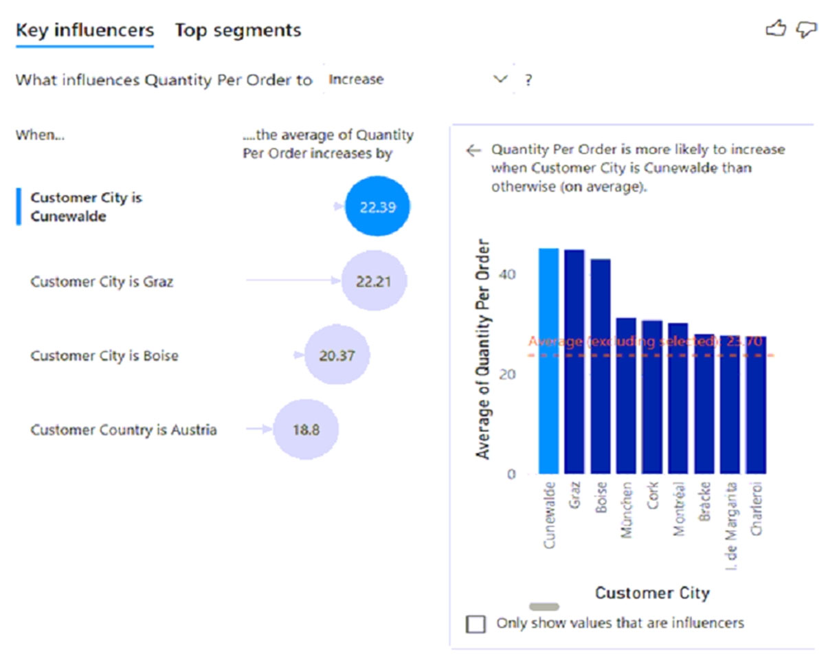
What can you identify from the visual?
Answer:
A
Average quantity of units is displayed.
Incorrect:
Not B: Average quantity of units is displayed, not percentage.
Reference:
https://docs.microsoft.com/en-us/power-bi/visuals/power-bi-visualization-influencers
You have a report that contains four pages. Each page contains slicers for the same four fields.
Users report that when they select values in a slicer on one page, the selections are not persisted on other pages.
You need to recommend a solution to ensure that users can select a value once to filter the results on all the pages.
What are two possible recommendations to achieve this goal? Each correct answer presents a complete solution.
NOTE: Each correct selection is worth one point.
Answer:
BC
C: You can sync a slicer and use it on any or all pages in a report.
B: You can set filters at three different levels for the report: visual-level, page-level, and report-level.
Note: Suppose you want your report readers to be able to look at overall sales metrics, but also highlight performance for individual district managers and different time frames. You could create separate reports or comparative charts. You could add filters in the Filters pane. Or you could use slicers. Slicers are another way of filtering. They narrow the portion of the dataset that is shown in the other report visualizations.
Reference:
https://docs.microsoft.com/en-us/power-bi/create-reports/power-bi-report-add-filter https://docs.microsoft.com/en-us/power-bi/visuals/power-bi-visualization-slicers
You have a report that includes a card visualization.
You need to apply the following conditional formatting to the card while minimizing design effort:
✑ For values that are greater than or equal to 100, the font of the data label must be dark red.
✑ For values that are less than 100, the font of the data label must be dark gray.
Which type of format should you use?
Answer:
B
Finding the conditional formatting in the card visual is a bit tricky. There is no separate option for that. You need to go to the Format tab of the visual, and then expand the Data Label. The right beside the Data Label's colour you need to hover your mouse, and you will find a three dots icon appearing, which if you click on it, you will see Conditional Formatting.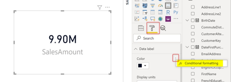
Now in the Conditional Formatting tab, you can apply it in different methods. for example, you can choose Rules, and then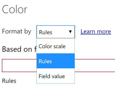
The Rules mode will give you the ability to put custom roles as below;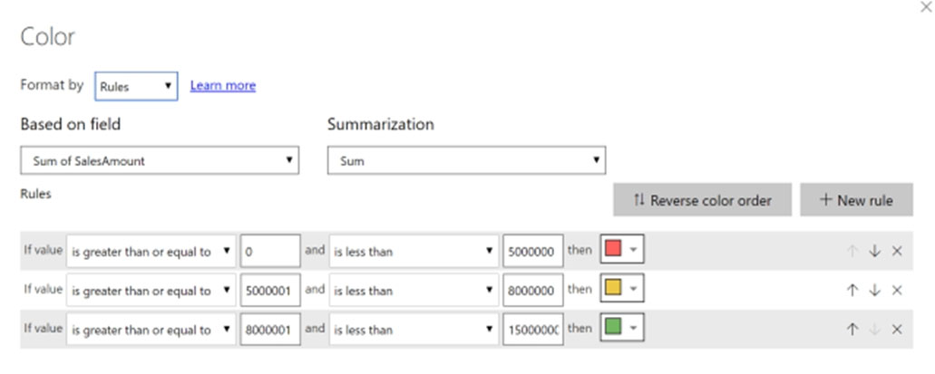
Reference:
https://radacad.com/enhance-the-card-visual-in-power-bi-with-conditional-formatting
DRAG DROP -
You have a Power BI dashboard named DashboardA that contains a tile named TileA. TileA contains a treemap visual from a report named ReportA.
You need to provide the users of DashboardA with additional tiles that relate to the contents of TileA.
Which three actions should you perform in sequence? To answer, move the appropriate actions from the list of actions to the answer area and arrange them in the correct order.
Select and Place: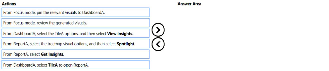
Answer:
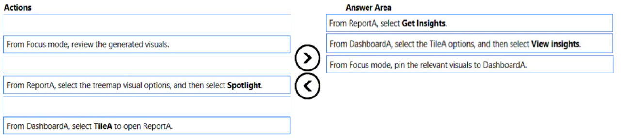
Step 1: From ReportA, select Get Insights
Then select 'Get Insights'ג€¦ From the Datasets + dataflows tab, select More options (...) next to the dataset, and then choose Get insights.
Power BI Quick Insights will now scan the data related to the tile and display a list of potential insights you may want to explore further. To drill into a specific data point, you can even select data in the visual and Quick Insights will focus on that data point when searching for insights.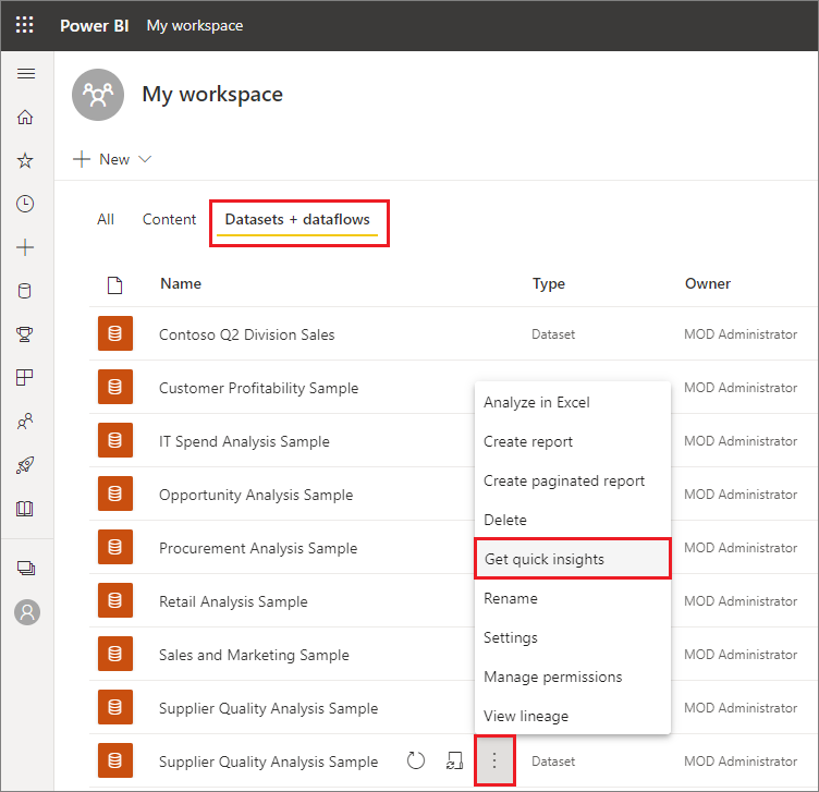
Power BI uses various algorithms to search for trends in your dataset.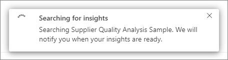
Within seconds, your insights are ready. Select View insights to display visualizations.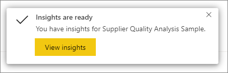
The visualizations display in a special Quick Insights canvas with up to 32 separate insight cards. Each card has a chart or graph plus a short description.
Step 2: From DashboardA, select the TileA options, and then select View Insights
The insight screen opens in Focus mode.
Step 3: From Focus mode, pin the relevant visuals to DashboardA
Go to 'in focus mode' on a dashboard tile for data loaded into Power BI.
Reference:
https://docs.microsoft.com/en-us/power-bi/create-reports/service-insights
You are creating a dashboard by using the Power BI service.
You have an existing report page that contains three charts.
You need to add the charts to the dashboard while maintaining the interactivity between the charts.
What should you do?
Answer:
D
One way to add a new dashboard tile is by pinning an entire report page. This is an easy way to pin more than one visualization at a time. Also, when you pin an entire page, the tiles are live; you can interact with them right there on the dashboard. And changes you make to any of the visualizations back in the report editor, like adding a filter or changing the fields used in the chart, are reflected in the dashboard tile as well.
Pinning live tiles from reports to dashboards is only available in Power BI service (app.powerbi.com).
Reference:
https://docs.microsoft.com/en-us/power-bi/create-reports/service-dashboard-pin-live-tile-from-report
DRAG DROP -
In Power Query Editor, you have three queries named ProductCategory, ProductSubCategory, and Product.
Every Product has a ProductSubCategory.
Not every ProductsubCategory has a parent ProductCategory.
You need to merge the three queries into a single query. The solution must ensure the best performance in Power Query.
How should you merge the tables? To answer, drag the appropriate merge types to the correct queries. Each merge type may be used once, more than once, or not at all. You may need to drag the split bar between panes or scroll to view content.
NOTE: Each correct selection is worth one point.
Select and Place: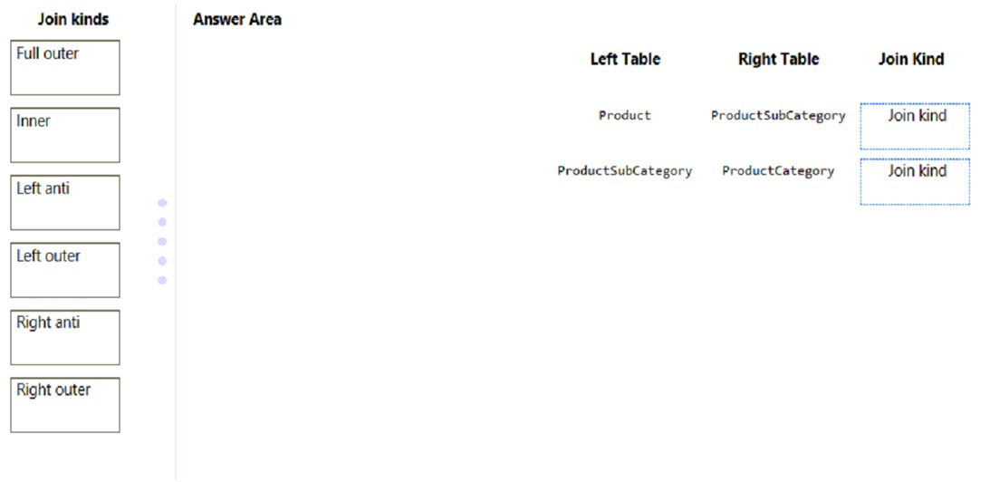
Answer:
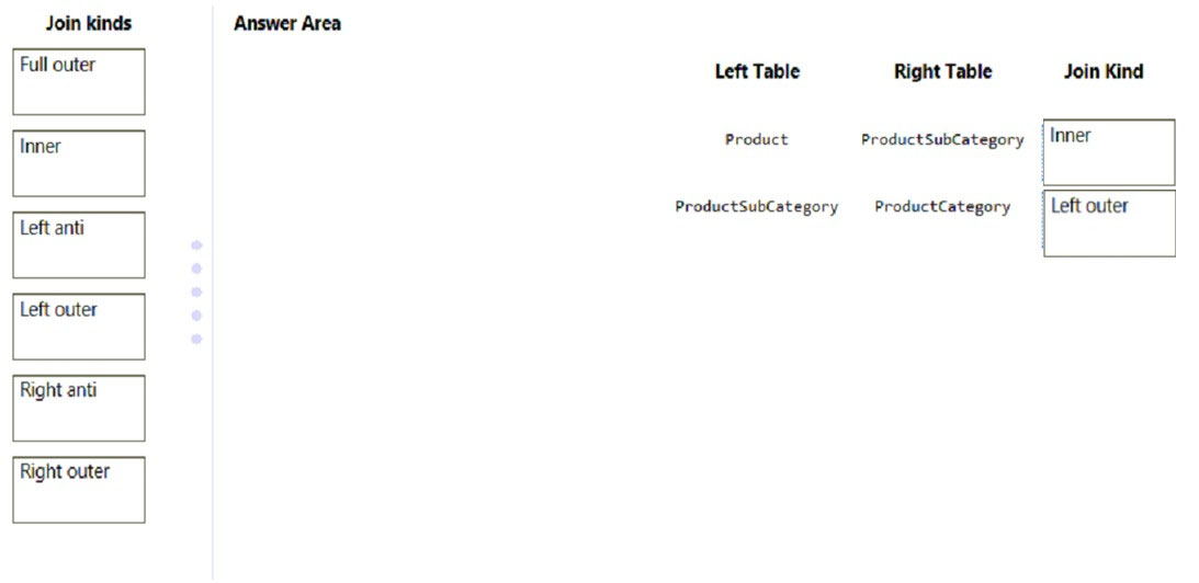
Box 1: Inner -
Every Product has a ProductSubCategory.
A standard join is needed.
One of the join kinds available in the Merge dialog box in Power Query is an inner join, which brings in only matching rows from both the left and right tables.
Box 2: Left outer -
Not every ProductsubCategory has a parent ProductCategory.
One of the join kinds available in the Merge dialog box in Power Query is a left outer join, which keeps all the rows from the left table and brings in any matching rows from the right table.
Reference:
https://docs.microsoft.com/en-us/power-query/merge-queries-inner https://docs.microsoft.com/en-us/power-query/merge-queries-left-outer
You are building a Power BI report that uses data from an Azure SQL database named erp1.
You import the following tables.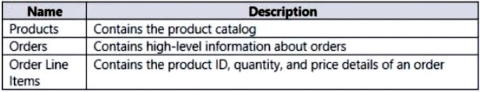
You need to perform the following analyses:
✑ Orders sold over time that include a measure of the total order value
Orders by attributes of products sold
The solution must minimize update times when interacting with visuals in the report.
What should you do first?
Answer:
D
A merge queries operation joins two existing tables together based on matching values from one or multiple columns.
Join the Orders and the Order Line Items tables.
Reference:
https://docs.microsoft.com/en-us/power-query/merge-queries-overview
You have a Microsoft SharePoint Online site that contains several document libraries.
One of the document libraries contains manufacturing reports saved as Microsoft Excel files. All the manufacturing reports have the same data structure.
You need to use Power BI Desktop to load only the manufacturing reports to a table for analysis.
What should you do?
Answer:
A
Get Data from SharePoint folder + select Combine & Load to load the data from all of the files in the SharePoint folder directly into your app.
Note: Connect to a SharePoint folder from Power Query Desktop
To connect to a SharePoint folder:
1. From Get Data, select SharePoint folder.
2. Paste the SharePoint site URL you copied in Determine the site URL to the Site URL text box in the SharePoint folder dialog box. In this example, the site URL is https://contoso.sharepoint.com/marketing/data. If the site URL you enter is invalid, a warning icon. warning icon will appear next to the URL text box.
SharePoint folder selection.
3. Select OK to continue.
4. If this is the first time you've visited this site address, select the appropriate authentication method. Enter your credentials and choose which level to apply these settings to. Then select Connect.
5. When you select the SharePoint folder you want to use, the file information about all of the files in that SharePoint folder are displayed. In addition, file information about any files in any subfolders is also displayed.
6. Select Combine & Transform Data to combine the data in the files of the selected SharePoint folder and load the data into the Power Query Editor for editing. Or select Combine & Load to load the data from all of the files in the SharePoint folder directly into your app.
Reference:
https://docs.microsoft.com/en-us/power-query/connectors/sharepointfolder
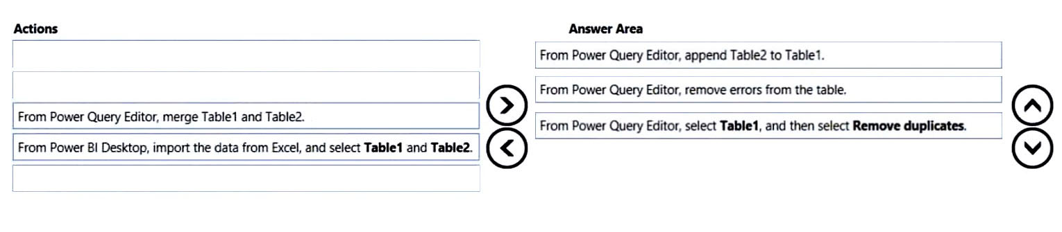
DRAG DROP -
You have a Microsoft Excel workbook that contains two sheets named Sheet1 and Sheet2.
Sheet1 contains the following table named Table1.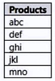
Sheet2 contains the following table named Table2.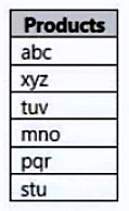
You need to use Power Query Editor to combine the products from Table1 and Table2 into the following table that has one column containing no duplicate values.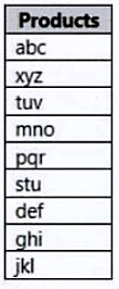
Which three actions should you perform in sequence? To answer, move the appropriate actions from the list of actions to the answer area and arrange them in the correct order.
Select and Place: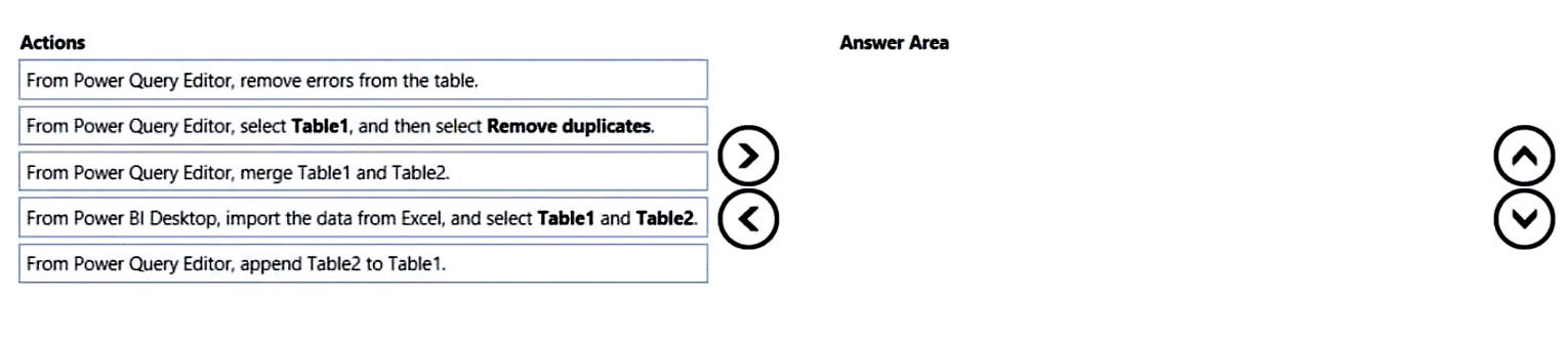
Answer:
Reference:
https://docs.microsoft.com/en-us/power-bi/connect-data/desktop-shape-and-combine-data
You have a CSV file that contains user complaints. The file contains a column named Logged. Logged contains the date and time each complaint occurred. The data in Logged is in the following format: 2018-12-31 at 08:59.
You need to be able to analyze the complaints by the logged date and use a built-in date hierarchy.
What should you do?
Answer:
D
Extract the date, which is the first 11 characters.
CSV files have no data types.
Note: A CSV is a comma-separated values file, which allows data to be saved in a tabular format. CSVs look like a garden-variety spreadsheet but with a . csv extension. CSV files can be used with most any spreadsheet program, such as Microsoft Excel or Google Spreadsheets.
Reference:
https://www.bigcommerce.com/ecommerce-answers/what-csv-file-and-what-does-it-mean-my-ecommerce-business/